
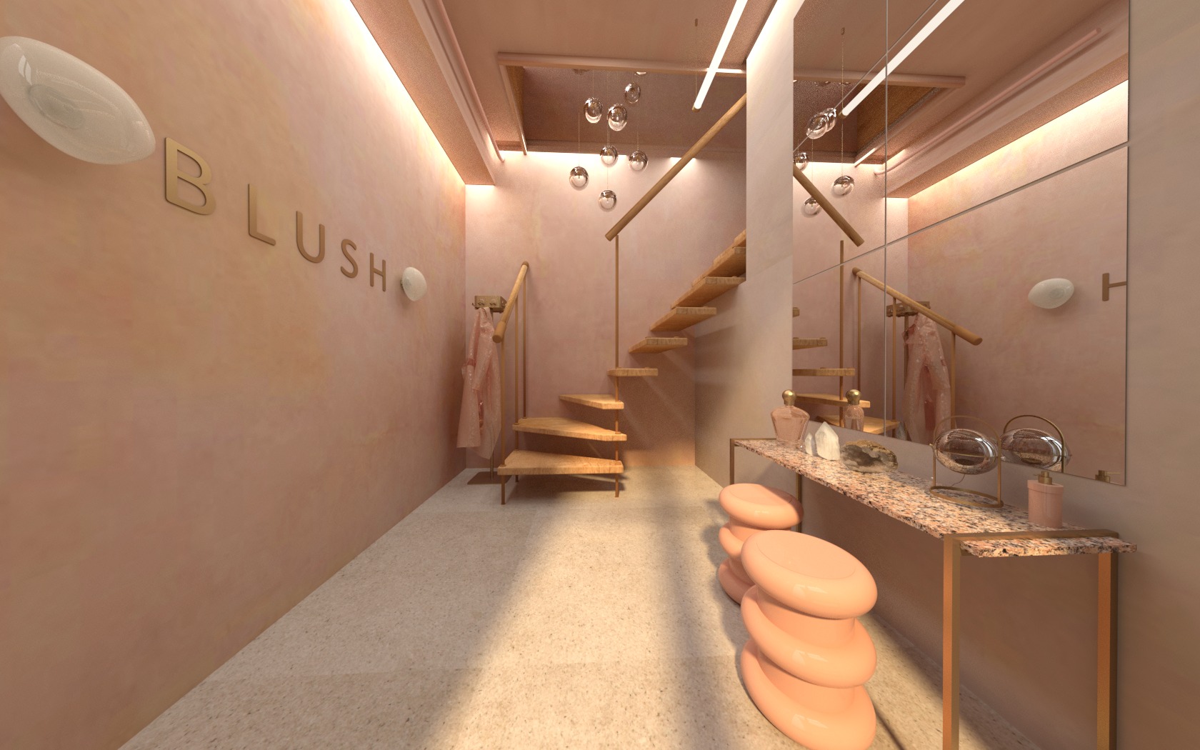


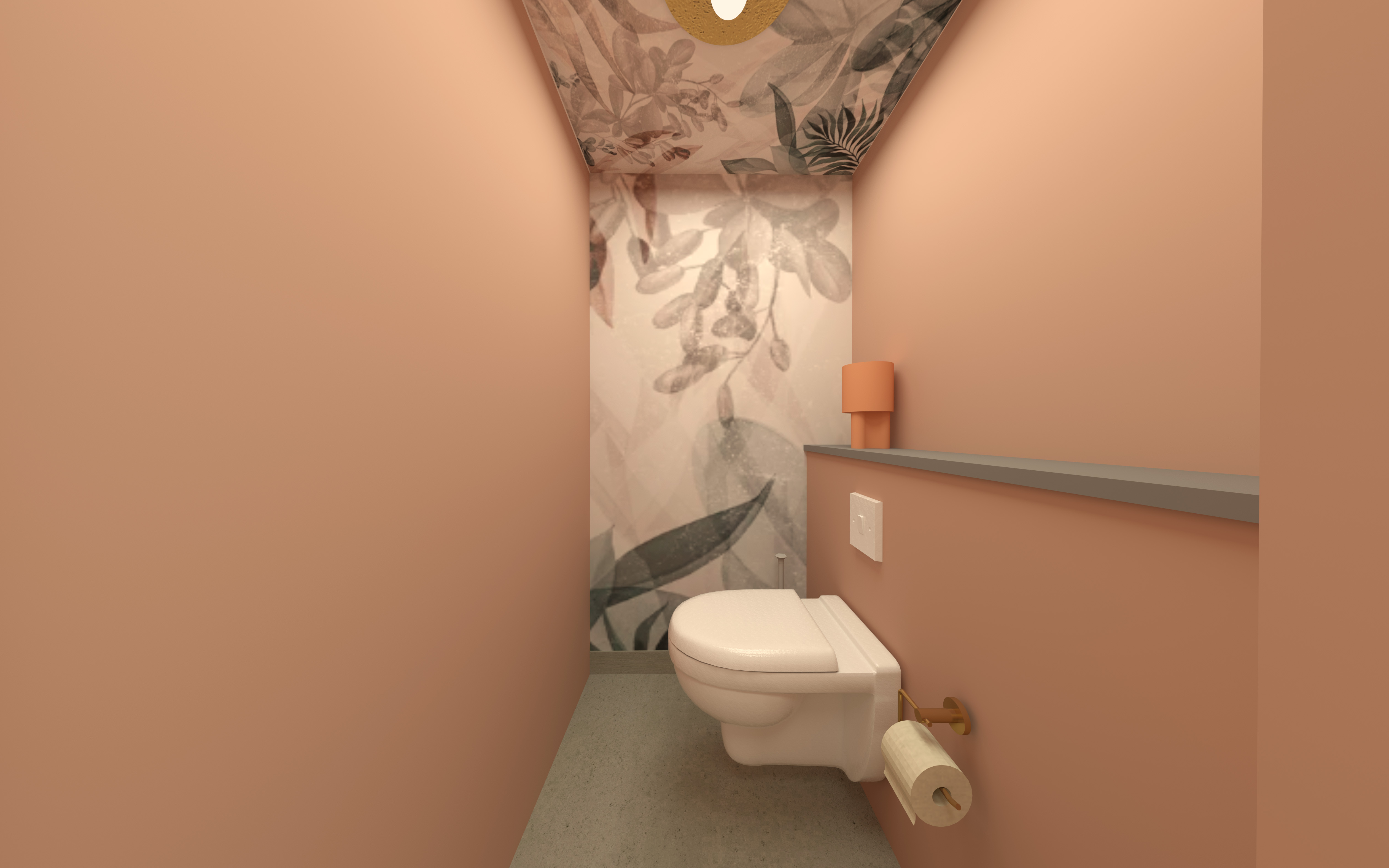
BLUSH Interior design for a beauty salon located in Haarlem the Netherlands. Blush aimed for a stronger brand identity throughout its whole brand. The colour pink, referring to pink and healhty glowing cheeks, is iconic for the brand. The new building had quite a lot of industrial features. By combining both the statement colour pink and these features, a balanced combination between softer and harder elements has been created.
Realisation: https://www.haarlemcityblog.nl/health-beauty/blush-skin-institute-nieuwe-locatie-laser/


STRAATWAARDEPart of graduation project Academie Artemis
(Art Academy in Amsterdam).
Creating interior products out of garbage, resulting into a collection of hand made tiles and partly 3D printed lamps. For more information visit www.straatwaarde.com
(Art Academy in Amsterdam).
Creating interior products out of garbage, resulting into a collection of hand made tiles and partly 3D printed lamps. For more information visit www.straatwaarde.com